Qrb Week 3
Submitted by: Submitted by lerocha3
Views: 979
Words: 1810
Pages: 8
Category: Business and Industry
Date Submitted: 07/20/2010 11:16 AM
Team D Week 3 Assignment
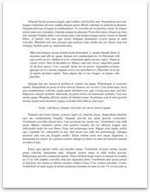
Leslie
Activity 1.3 Topic 1
SATs and the Super Bowl: Creating and Interpreting Histograms
1. Bar Graphs usually display categorical data creating a value to each data point. Histograms usually display a continuous range of data; in which the bars must touch because the data is one consecutive set of data.
2. The range of the “percent taking test” is the difference between the greatest value and the least value in the data set. Example: 77 – 4 = 73.
3. I would use the following intervals in order to capture all the data points: 0-15, 15-30, 30-45, 45-60, 60-75, 75-90.
4. It is important to group the data to help sort through large amounts of data, creating less bars on the table, and every possible data is contained within an interval.
5. Intervals must be equal width in order to ensure validity when presenting the data.
6.
|Interval |Frequency |
|0-15 |6 |
|15-30 |1 |
|30-45 |0 |
|45-60 |1 |
|60-75 |6 |
|75-90 |1 |
7. My histogram starts high, drops low, hits bottom, creeps up, jumps high, and drops low.
8.
|Interval |Frequency |
|0-15 |20 |
|15-30 |5 |
|30-45 |2 |
|45-60 |7 |
|60-75 |12 |
|75-90 |5 |
[pic]
9. This Histogram has data for all interval sets, continues to have a significant drop from the first interval to the second interval, the third interval is almost at the bottom of the table and then the data increases to the fifth interval. Both diagrams show a significant increase in frequency within the first and fifth intervals and lows in between. The comparison shows us that when reviewing the full data the story portrayed is more realistic, but the basic trends are still intact.
10.
[pic]
11....