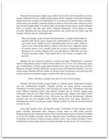
Paperfp
Submitted by: Submitted by gotmilk619
Views: 199
Words: 416
Pages: 2
Category: Business and Industry
Date Submitted: 03/12/2011 03:06 PM
Box-and-Whisker Plots
Making a Box-and-Whisker Plot
Step 1: Arrange the values in increasing order and compute [pic].
Step 2: Draw a number line that includes the minimum and maximum values.
Step 3: Make a box whose left end is at [pic] and whose right end is at [pic].
Step 4: Draw vertical line segment to divide the box at, [pic], the median.
Step 5: Draw a line segment from [pic] to the minimum value and another line segment from [pic] to the maximum value for the left and right whiskers.
A box-and-whisker plot displays how the values of the data are distributed.
Outliers
Outliers-are unusual data. A data value that is less than [pic] or greater than [pic].
Quartiles
First Quartile - median of the lower half of the data set
Second Quartile -median of the data set.
Third Quartile- median of the upper half of the data set
Interquartile range- [pic]
Example:
The number of calls received by a crisis hotline during 17 randomly selected is given below
|50 |57 |77 |66 |53 |72 |
|51 |88 |82 |70 |112 |107 |
|69 |88 |98 |65 |155 | |
Median is 72
The median of the lower half [pic] = 61
The median of the upper half [pic]
IQR = 93 – 61 = 32
Find any possible outliers below [pic]
[pic]
Find any possible outliers above [pic]
[pic]
There are no values less than or equal to 13. Because the data value 155 is greater than 141, 155 is a possible outlier.
You can use box-and-whisker plots to compare the distribution of two set of similar data, such as the monthly mean temperatures for two cities.
Monthly mean temperatures for Los Angles and Chicago (1961 – 1990)
|Months |Los Angeles...