Final Paper
Submitted by: Submitted by hereed828
Views: 313
Words: 861
Pages: 4
Category: English Composition
Date Submitted: 11/12/2012 10:53 AM
Hope Reed
CGD 218
Hope
Professor Day
January 31, 2011
Recently, I decided to start an at home business, selling books. I stewed on ideas and decided it was a worthy adventure with minimal loss of money out of the family’s budget. Having owned a business once before I understand the importance of ‘branding’ and logo design. I settled on an online bookstore selling on ebay with a forum for discussion about books with reviews and a blog spot. It would be a site where future authors could find resources for writing, publishing and discuss a new book. Deciding what I wanted was the easy part; I know books and love them. The hardest decision was the name for the new store. I toyed with some ideas and found it was easier to design a logo imagine in my mind and then settle on the name. I wanted something strong, believing that words can be the most powerful force out there when used correctly. I also wanted something simple. After toying with ideas I decided upon the name “Word Smith”. So for my final paper I decided to use what I learned from this class to design our logo for my new business. This paper is a step by step of what ideas were drawn up and what I decided on for a logo to communicate visually what I wanted my business to say to the public.
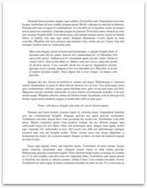
My first idea for a logo with “Word Smith” as the name was an anvil with a hammer and pen crossed in the background and the words “Word Smith” on the anvil. After fiddling with imagines and such I soon discovered the three images placed together formed a pentagram and it wasn’t the message I wanted to send to the public. So I quickly scratched that idea. Still wanting to keep it simple I incorporated using symbols to design this idea:
I liked this idea but it had a few flaws in my mind. The coloring was off to me, along with the balance of the imagines and the lighting. At first the quill was white and it was changed to the brown, some shading was done but in the end it just wasn’t the right fit...